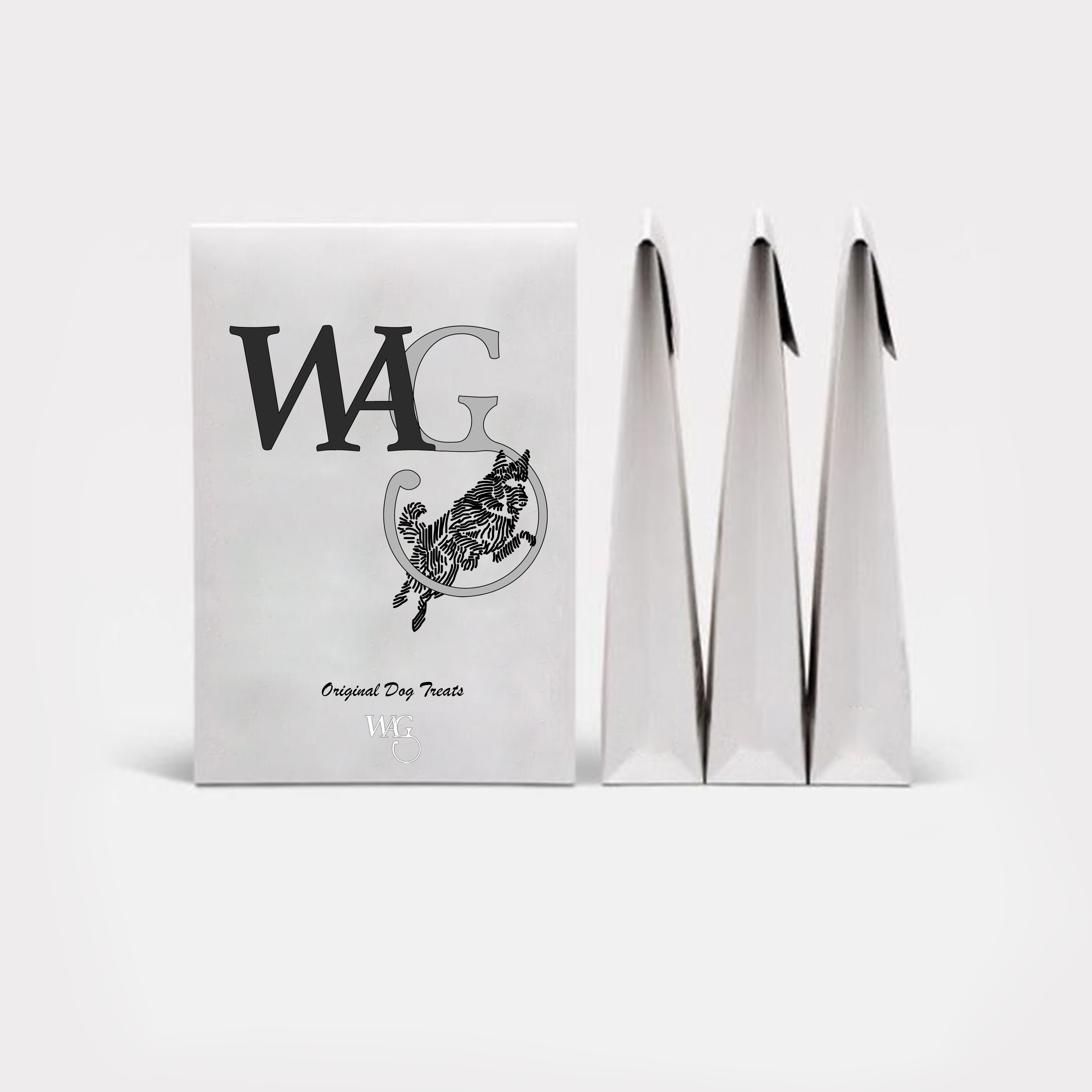
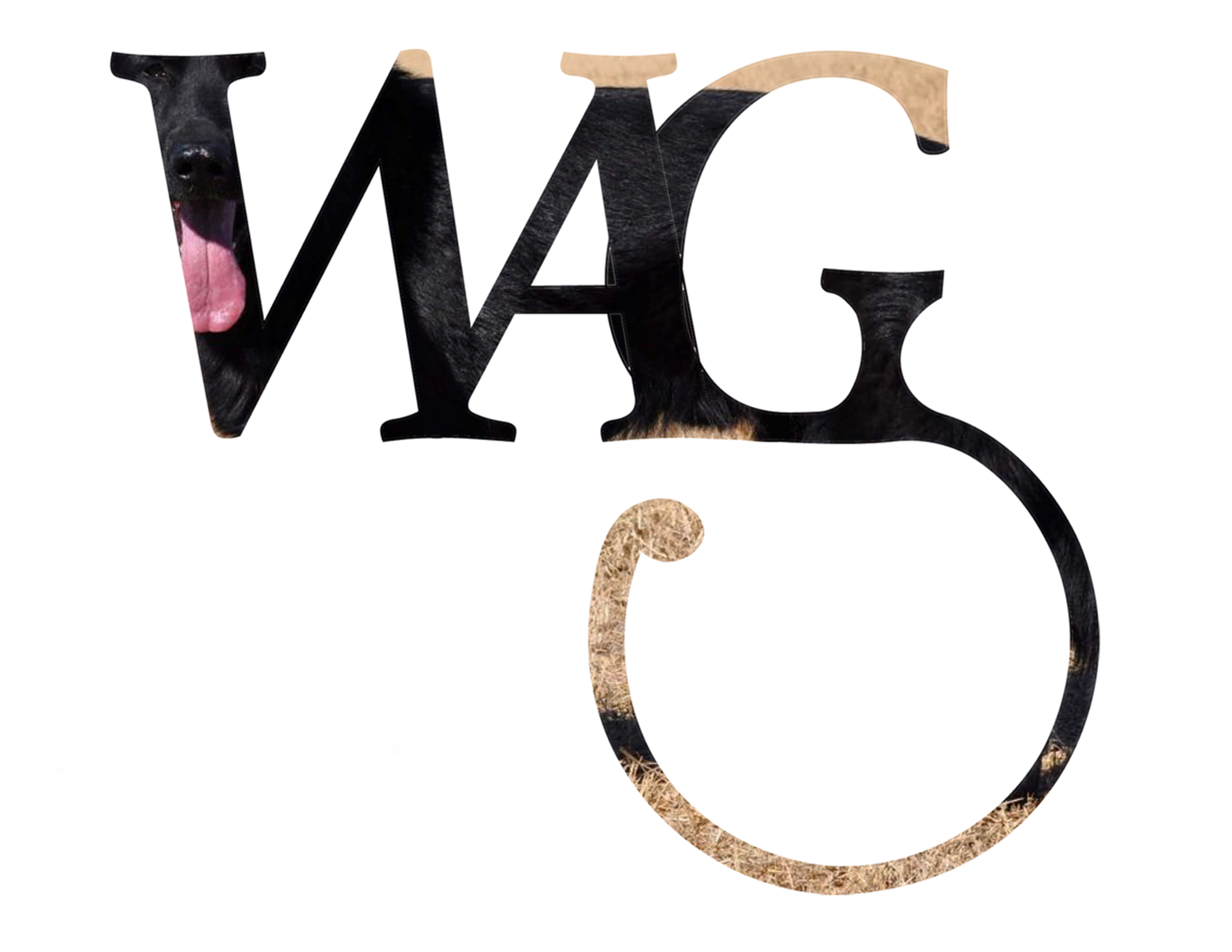
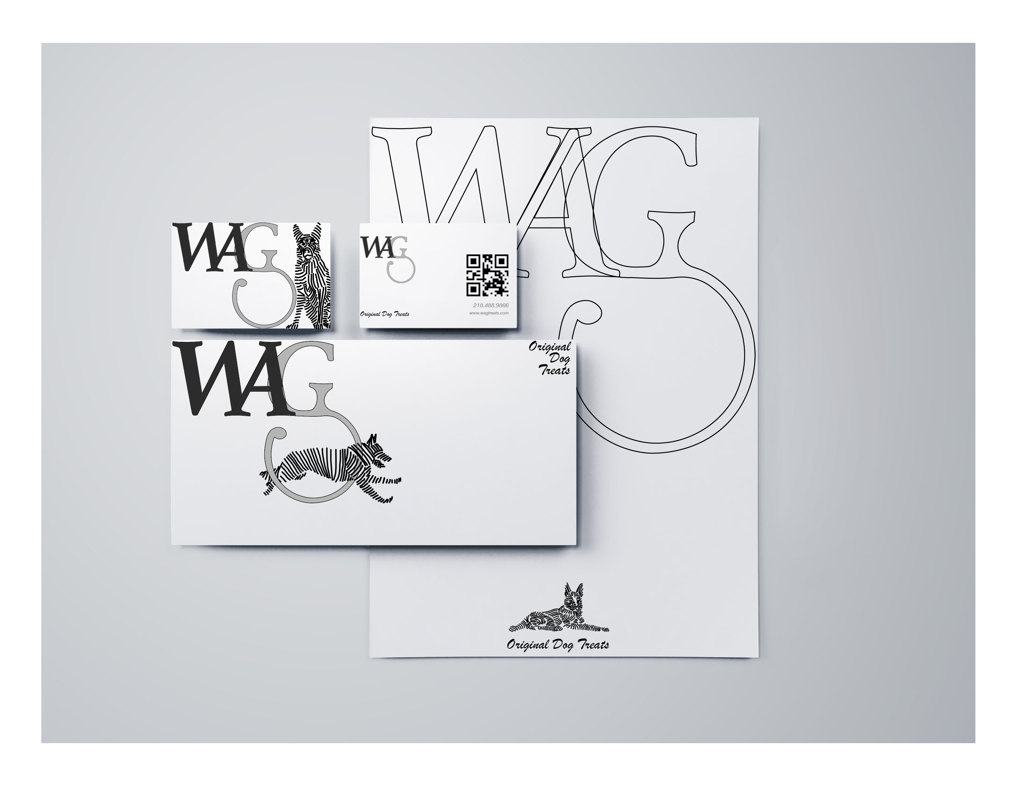
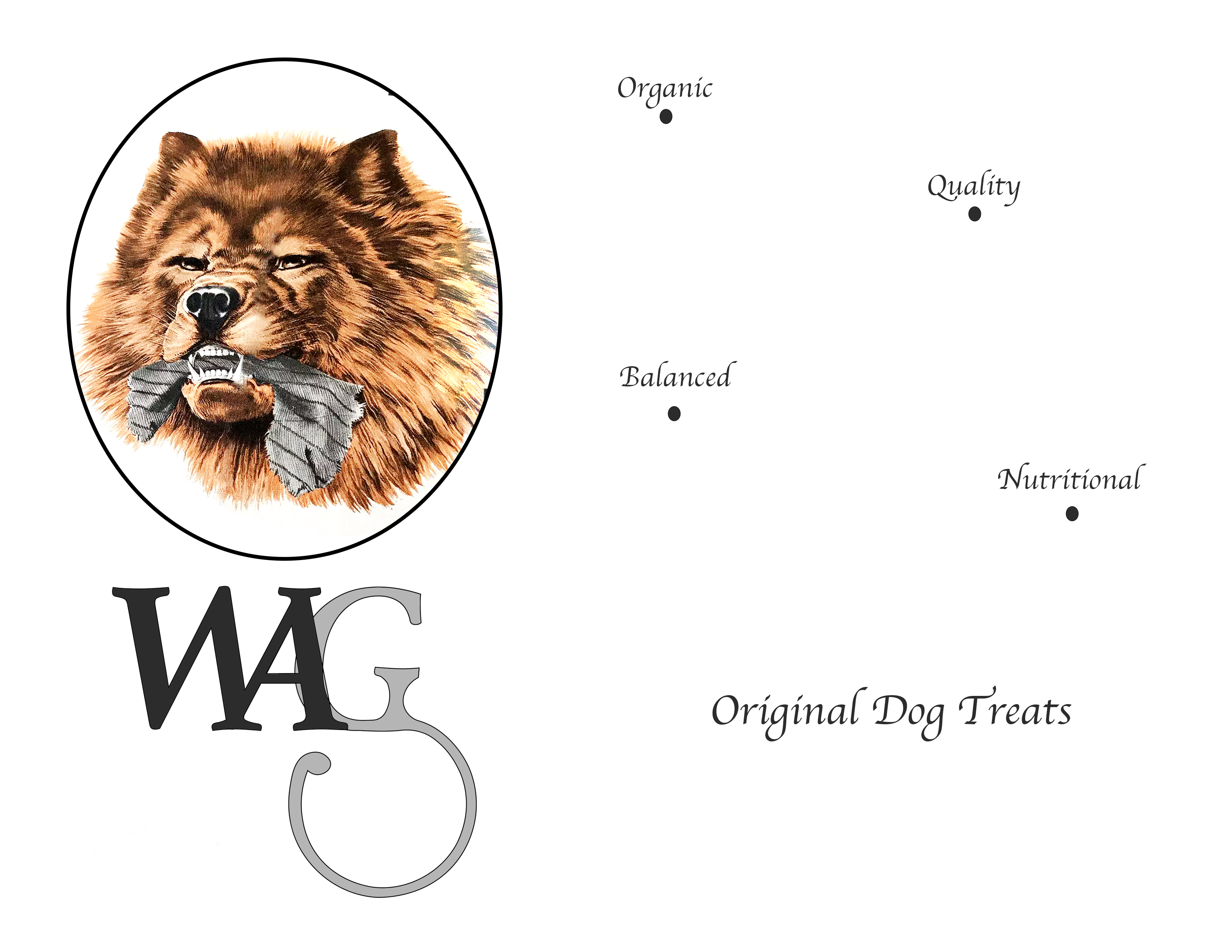
WAG - ORIGINAL DOG TREATS
This case study is a conceptual rebranding project for Wag dog treats. The goal of the project was to create a dynamic identity for Wag as it expands into the dog lifestyle market. The rebranding aims to create a playful and modern personality for the brand, which can be implemented across various packaging, collateral, and memorabilia.
.
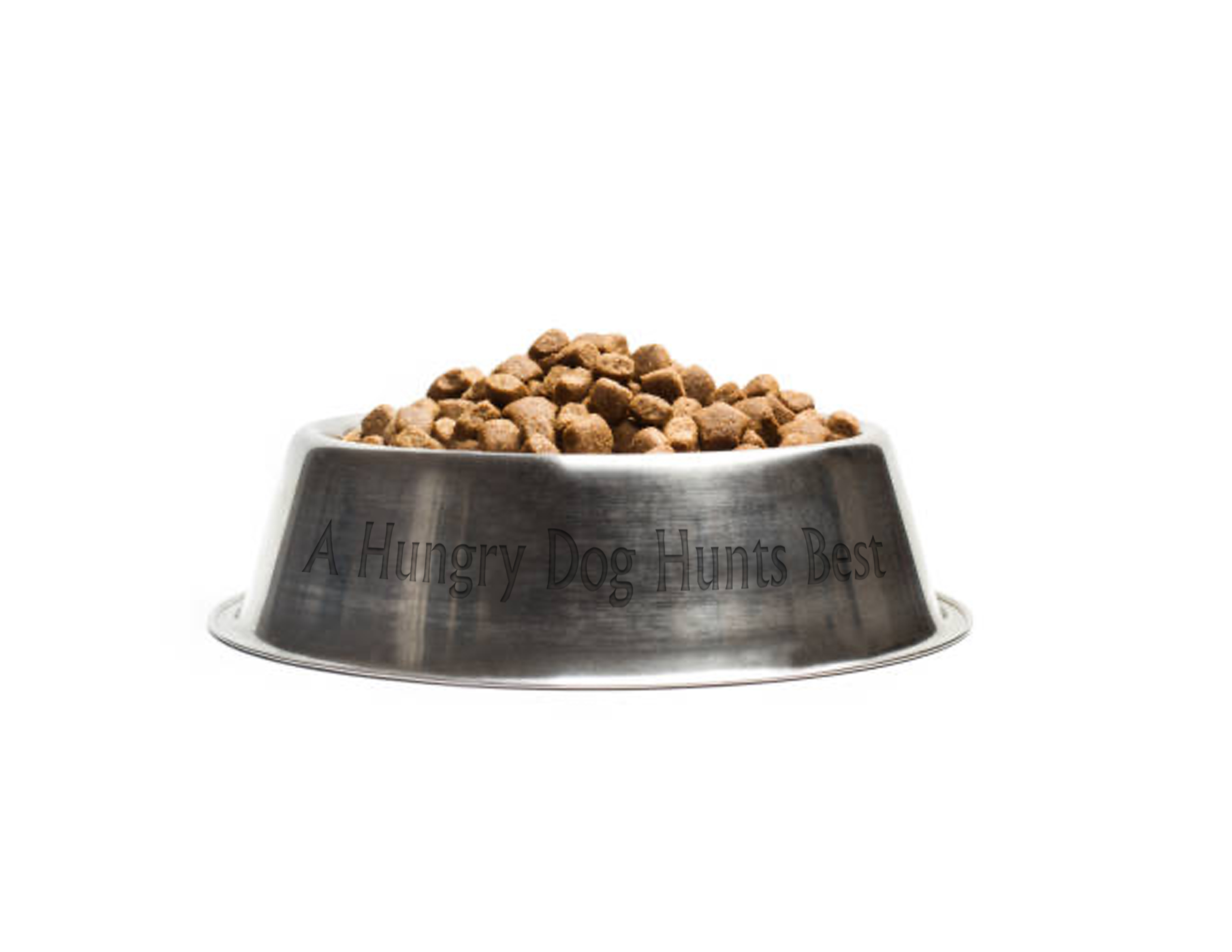
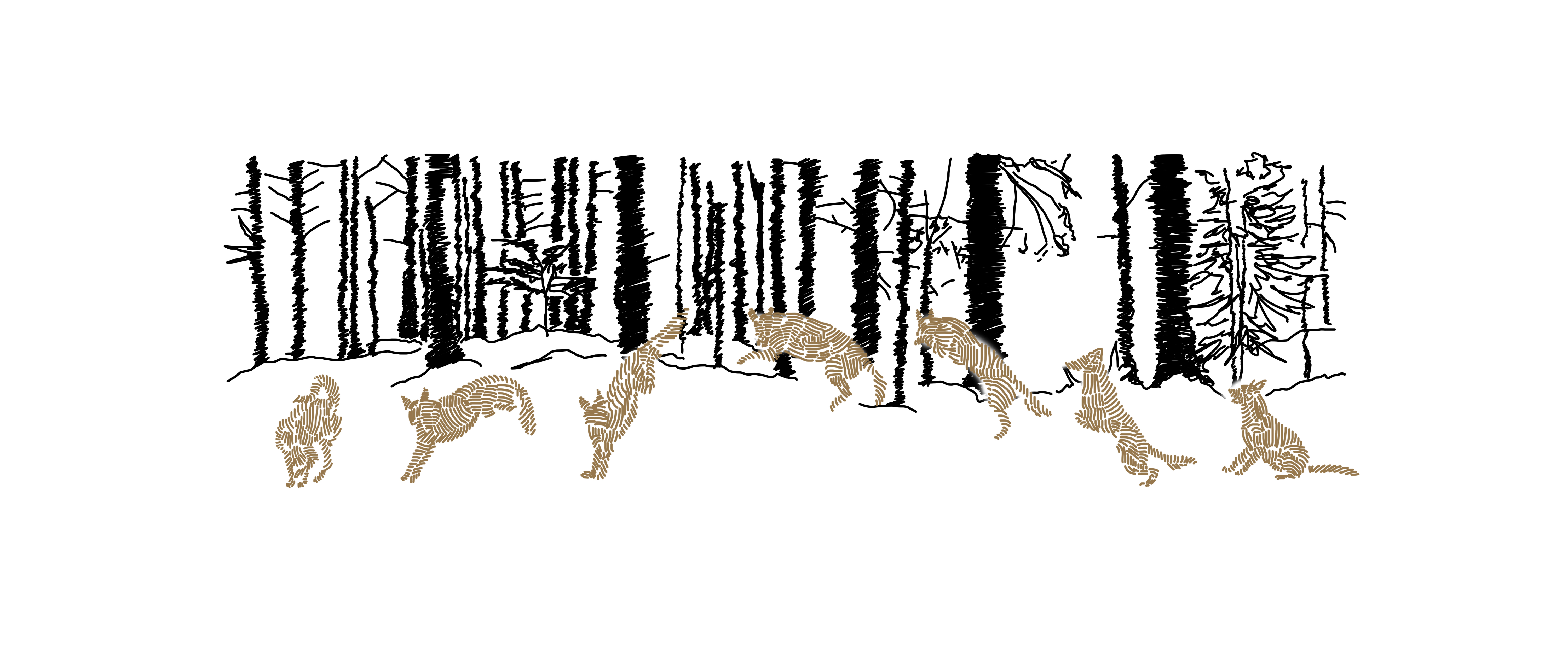
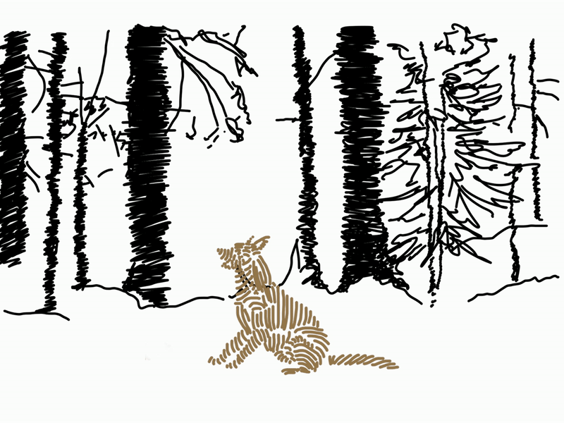
Are you tired of your dog's treats packaging clashing with the carefully curated aesthetic of your neutral styled home? And did you know that dogs only see in black and white? So why on earth does their treat packaging come in every color of the rainbow?
At Wag, we understand that your four-legged companion is not just a pet but a part of your family, and their treats deserve to reflect your stylish sensibilities.
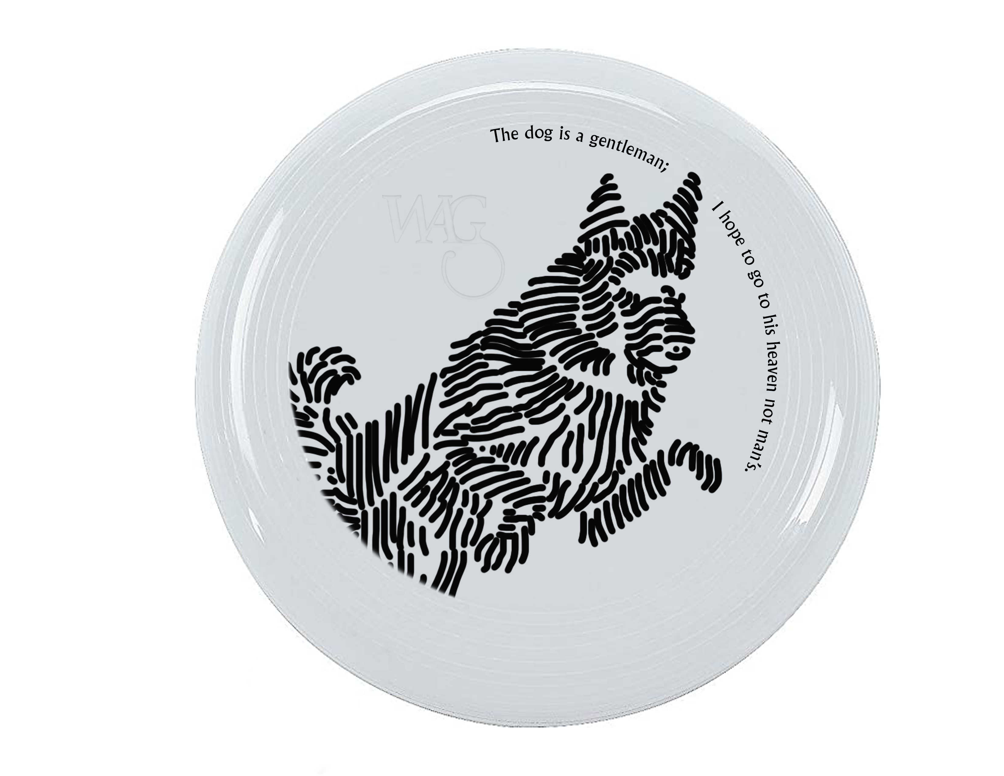
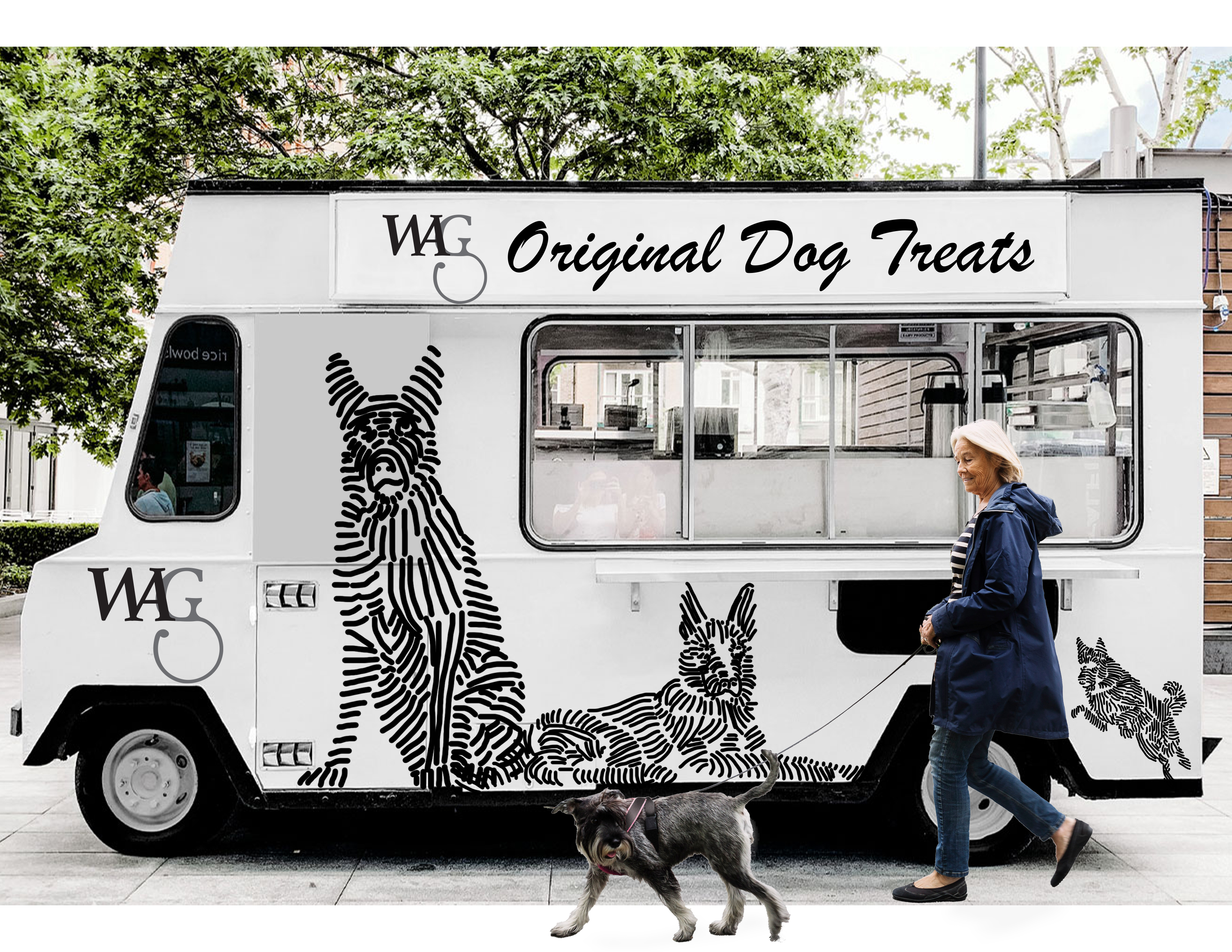
Our team embarked on a mission to create a visual identity that not only appeals to your discerning taste but also respects the monochromatic vision of your furry friend. Gone are the garish colors and mismatched packaging designs! We're here to redefine the dog treat experience with a brand that seamlessly integrates into your home and lifestyle.