Puzle, Digital Business Card and Networking
Puzle, a networking app for young professionals, needed a comprehensive branding guideline book that could unify the company's visual identity and ensure consistency across all marketing materials.
The objective of this case study was to develop a visual identity for Puzle that embodies the spirit of the next generation while paying homage to the classic “old world” ways of doing business. The aim was to demonstrate that it is indeed possible to create a dynamic, stylish, and credible visual identity that appeals to both young and seasoned professionals alike.
The objective of this case study was to develop a visual identity for Puzle that embodies the spirit of the next generation while paying homage to the classic “old world” ways of doing business. The aim was to demonstrate that it is indeed possible to create a dynamic, stylish, and credible visual identity that appeals to both young and seasoned professionals alike.
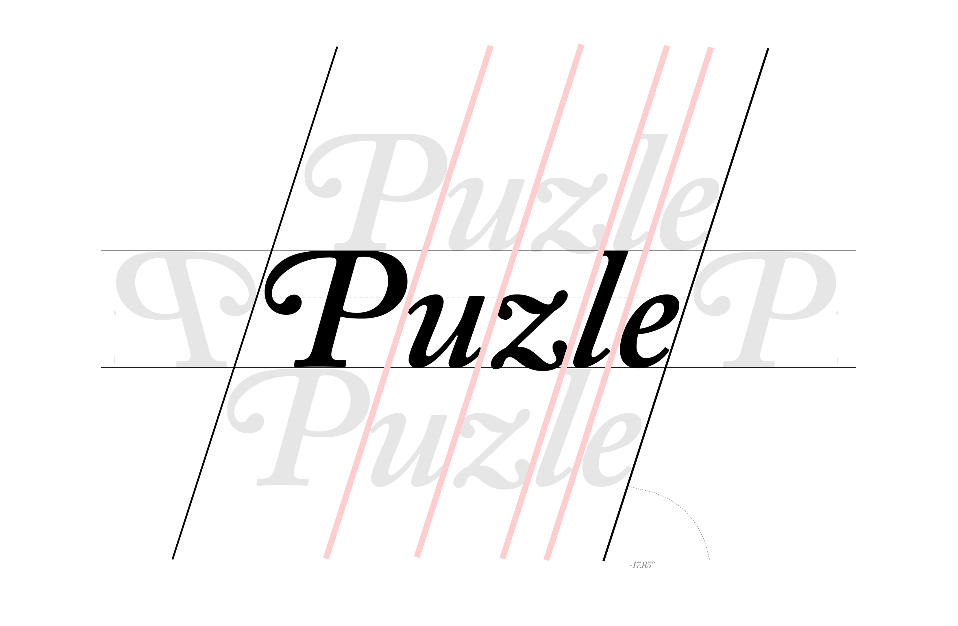
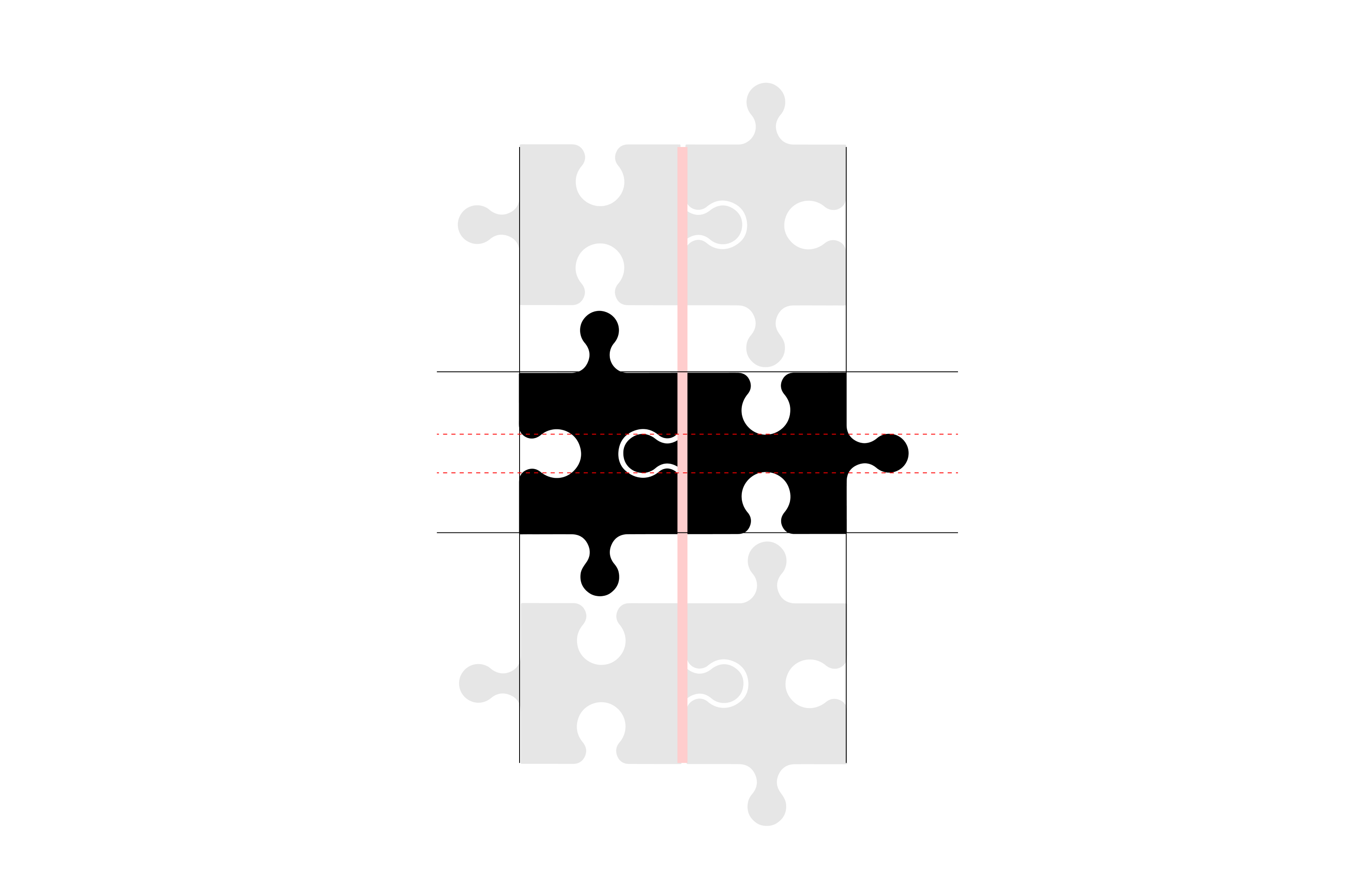
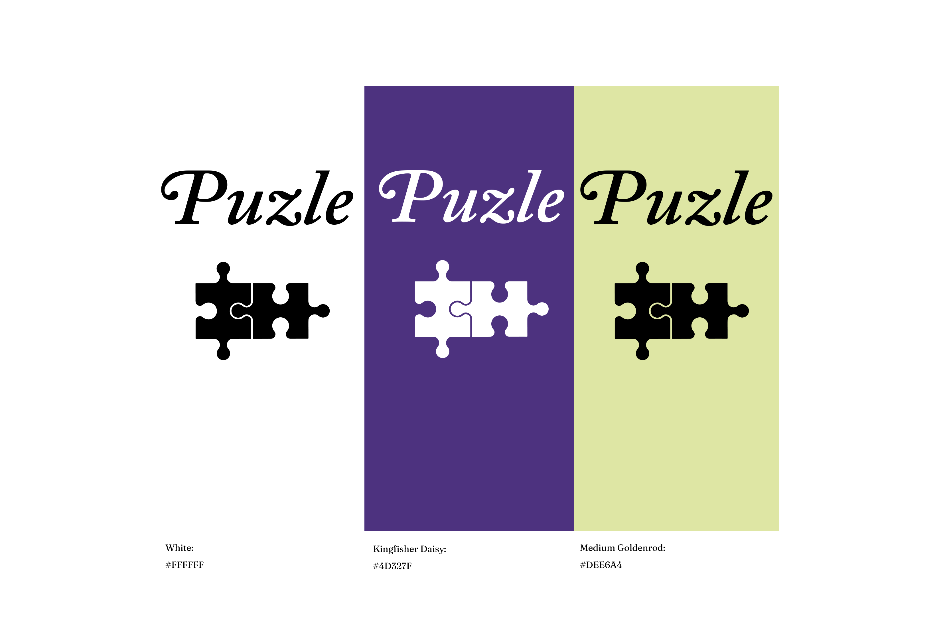
LOGO:
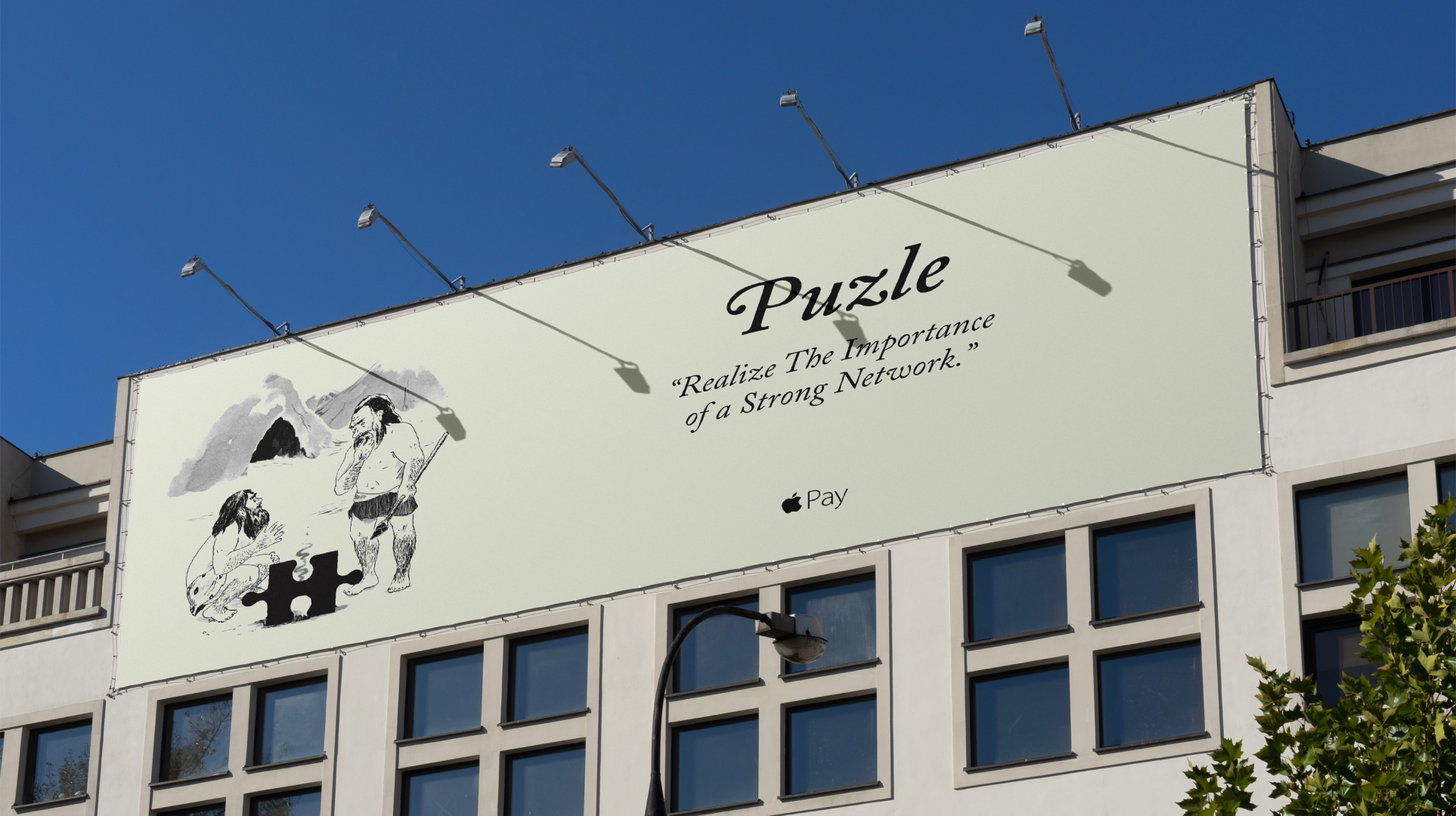
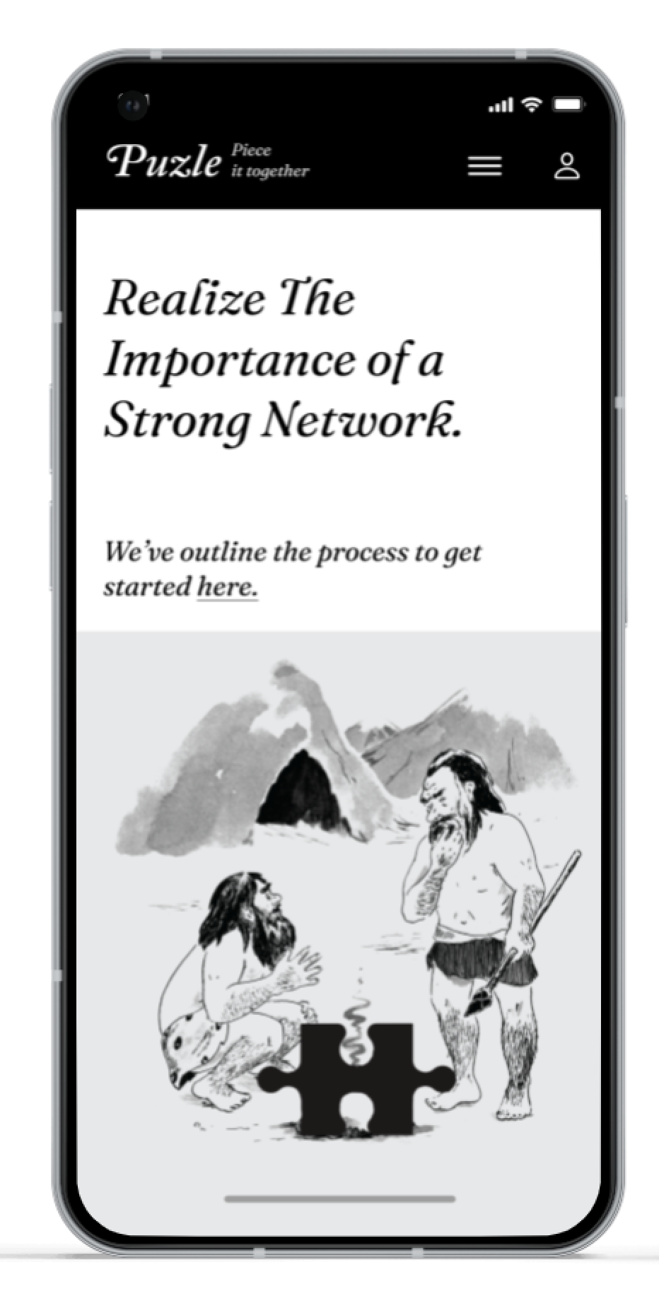
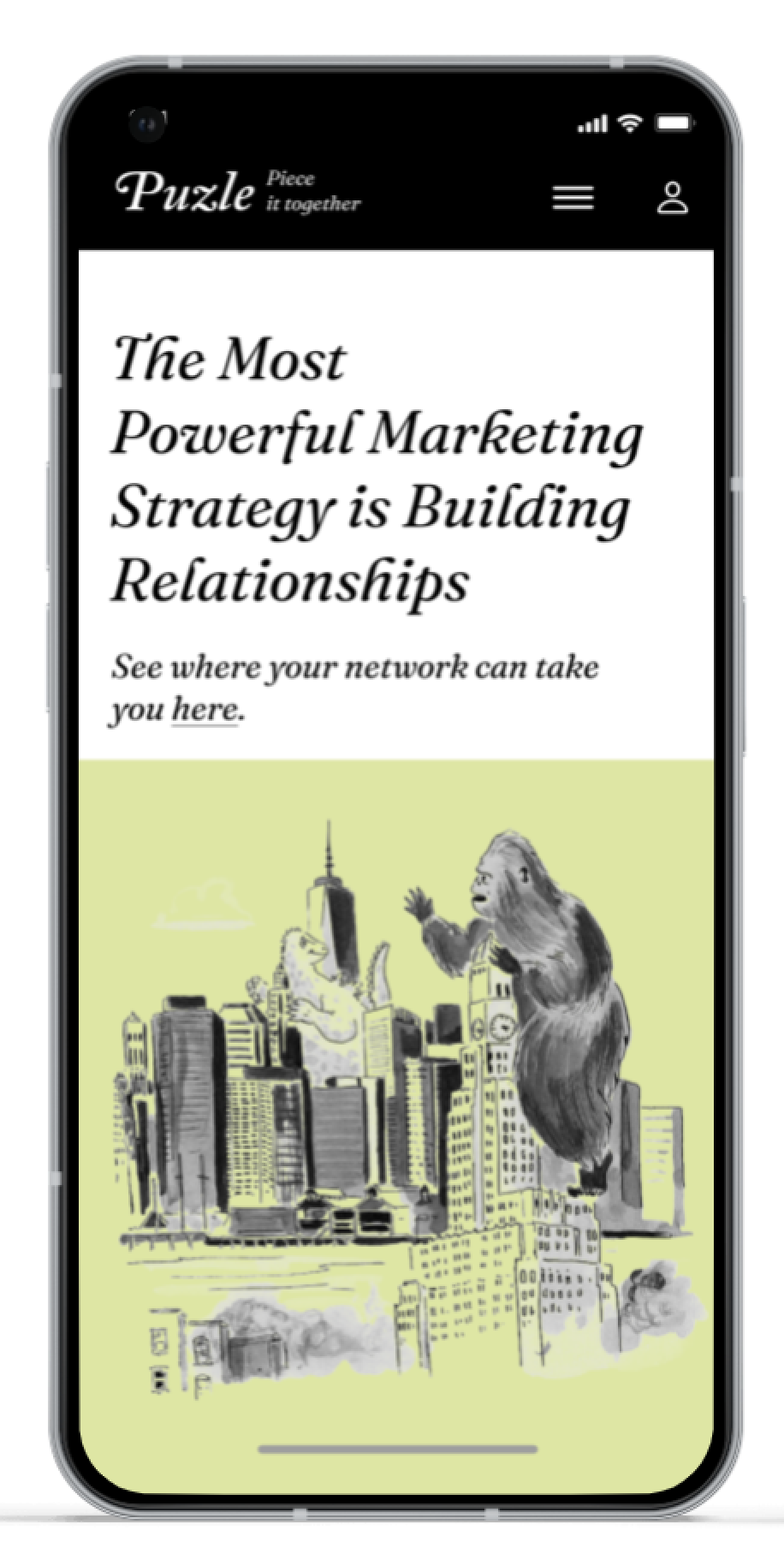
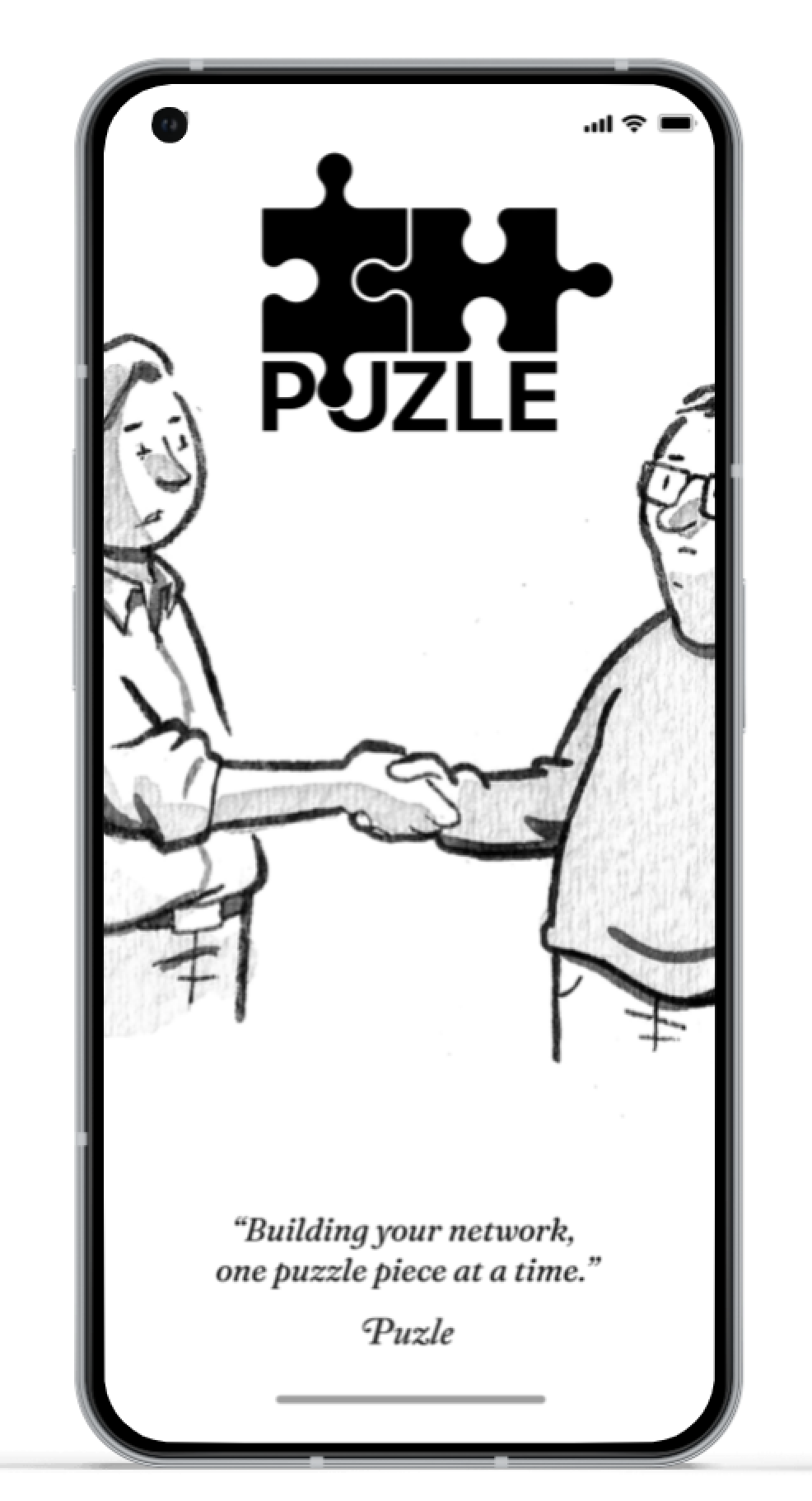
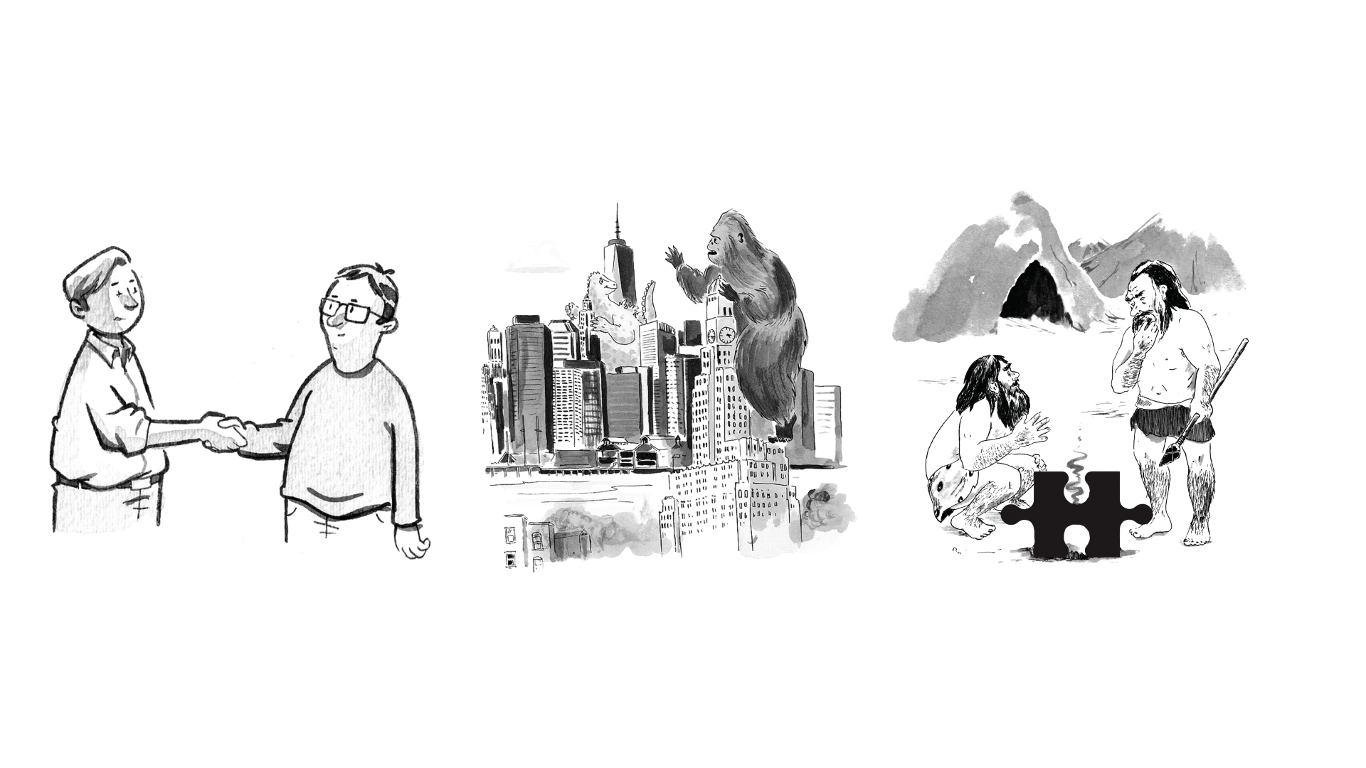
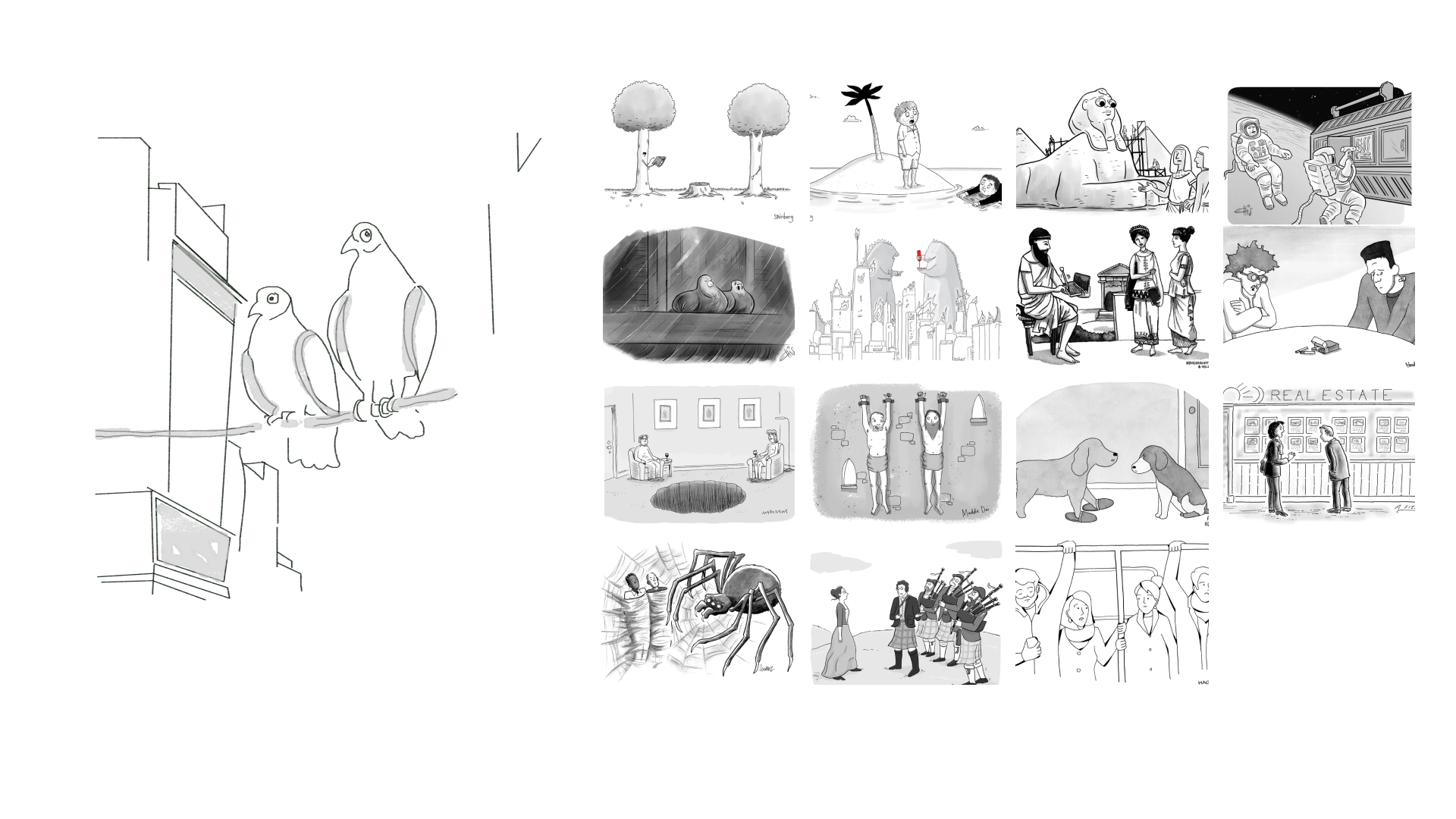
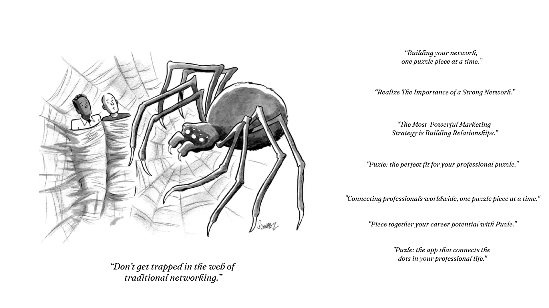
The inclusion of black and white illustrations featuring two characters in a unique environment, reminiscent of New Yorker cartoons, brings a touch of humor to the brand. These illustrations serve as a captivating visual element that not only adds personality but also establishes a distinct and memorable identity for the virtual business card app.
Humor has an ability to engage and resonate with audiences, making it a powerful tool for creating memorable brand experiences. By infusing the brand with a touch of humor through these illustrations, the app cultivates a sense of approachability and relatability. It creates an atmosphere that is not only professional but also enjoyable and lighthearted, fostering a positive emotional connection with users.
The unique environment and interactions depicted in the illustrations provide opportunities for storytelling and narrative-building.
The solution to this challenge was born out of merging the old and new worlds.
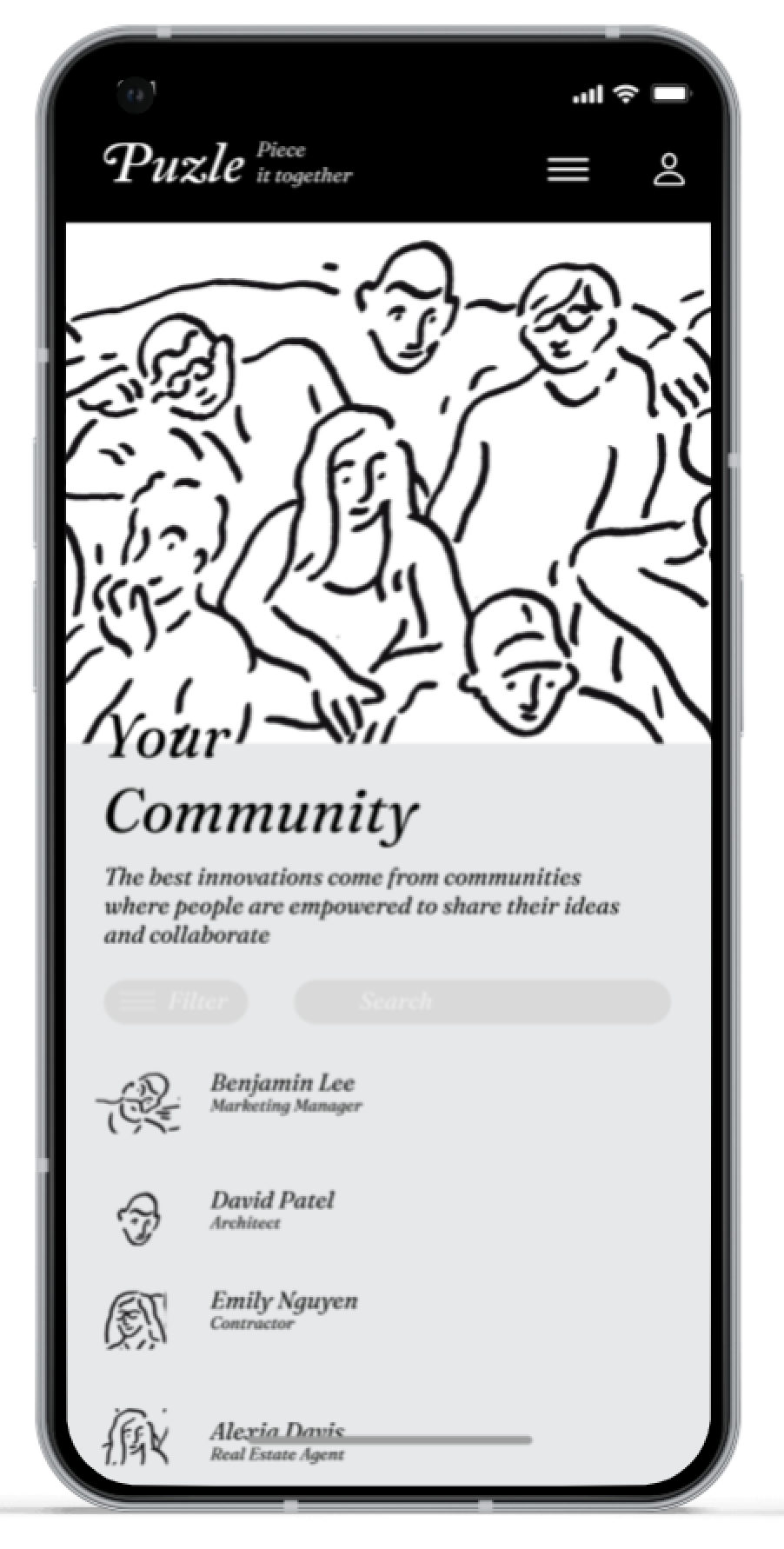
To bridge the gap, we drew inspiration from the nostalgic and trusted symbol of a physical newspaper, which represents the classic business era. By integrating this timeless aesthetic into a digital environment, we crafted an identity that exudes modernity and cleanliness while staying rooted in a timeless and familiar visual language.
The incorporation of elements reminiscent of a physical newspaper in the app's design and visual identity serves as a powerful bridge between traditional and contemporary networking. The clean and sleek digital interface embraces the energy and efficiency of modern technology, while the subtle cues of a newspaper-inspired design evoke a sense of trust, credibility, and familiarity.